
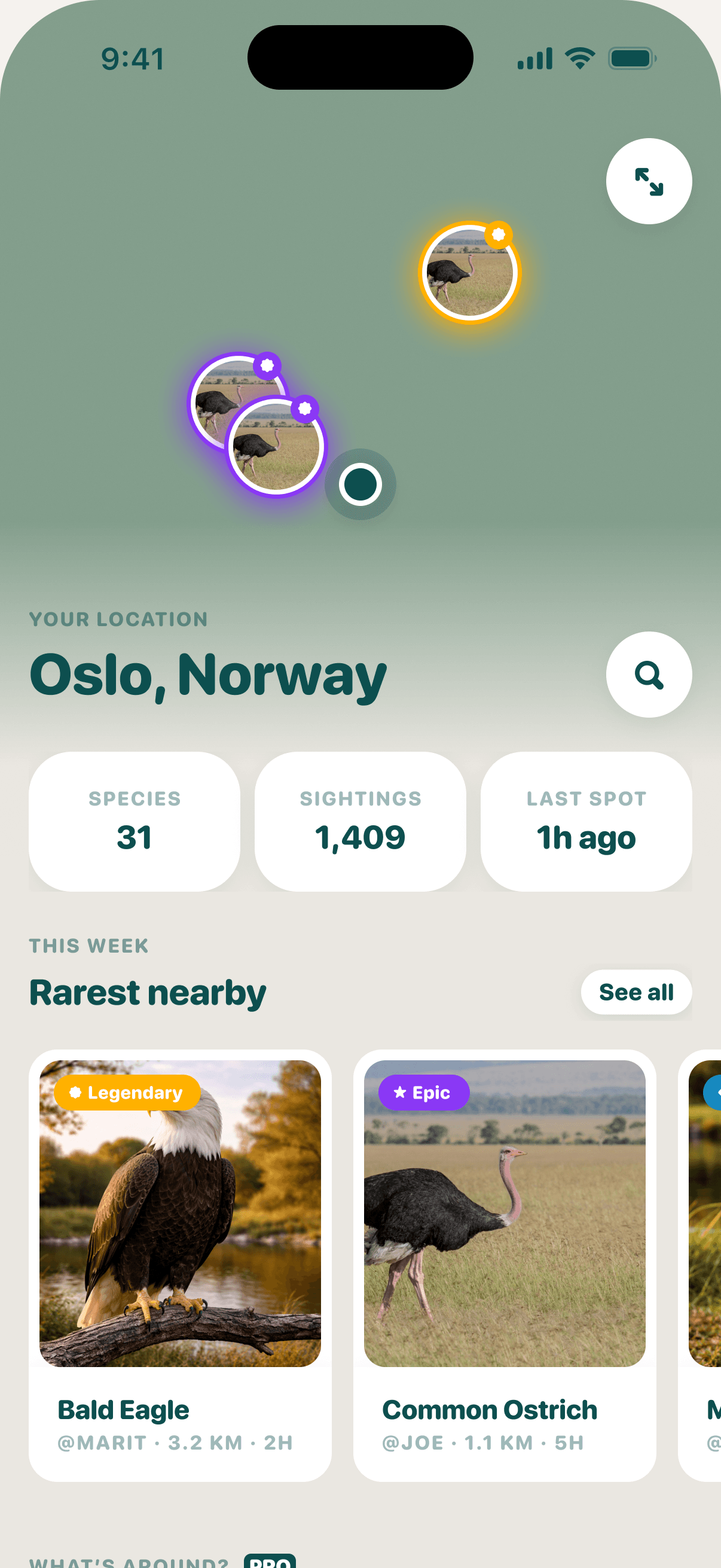
Birdie has always had a map. You open it, you see some pins, you tap one. It works, but I don't think anyone ever opened it just to have a look around. We wanted something that made you a bit curious about what's near you, and maybe got you outside.
So the map became Explore. A page about wherever you are, with the map tucked in at the top rather than being the whole thing.
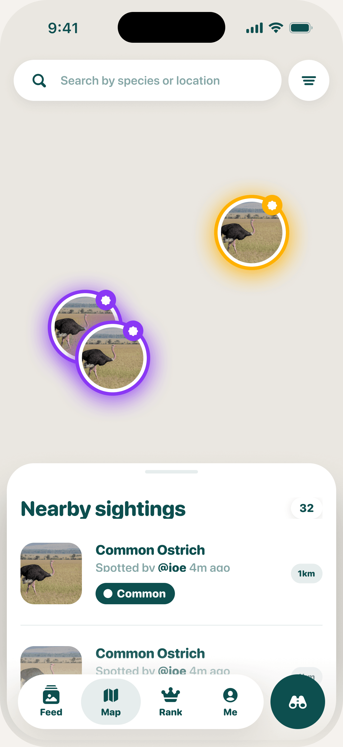
My first go was built from screenshots and a long description of what I wanted. It worked fine and looked tidy, but it felt like the old map with a nicer drawer. So my co-founder James went away and designed it properly in Figma, and I built from that.
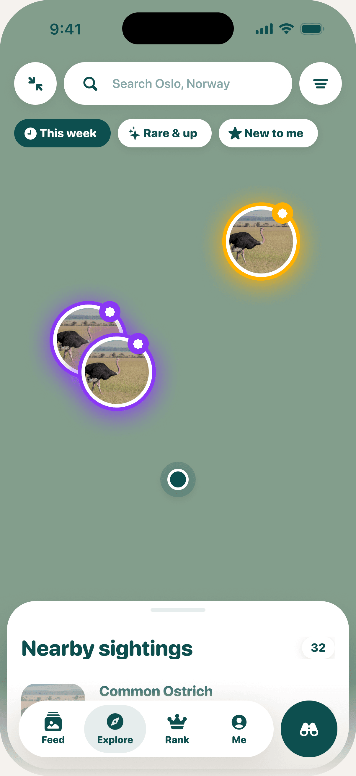
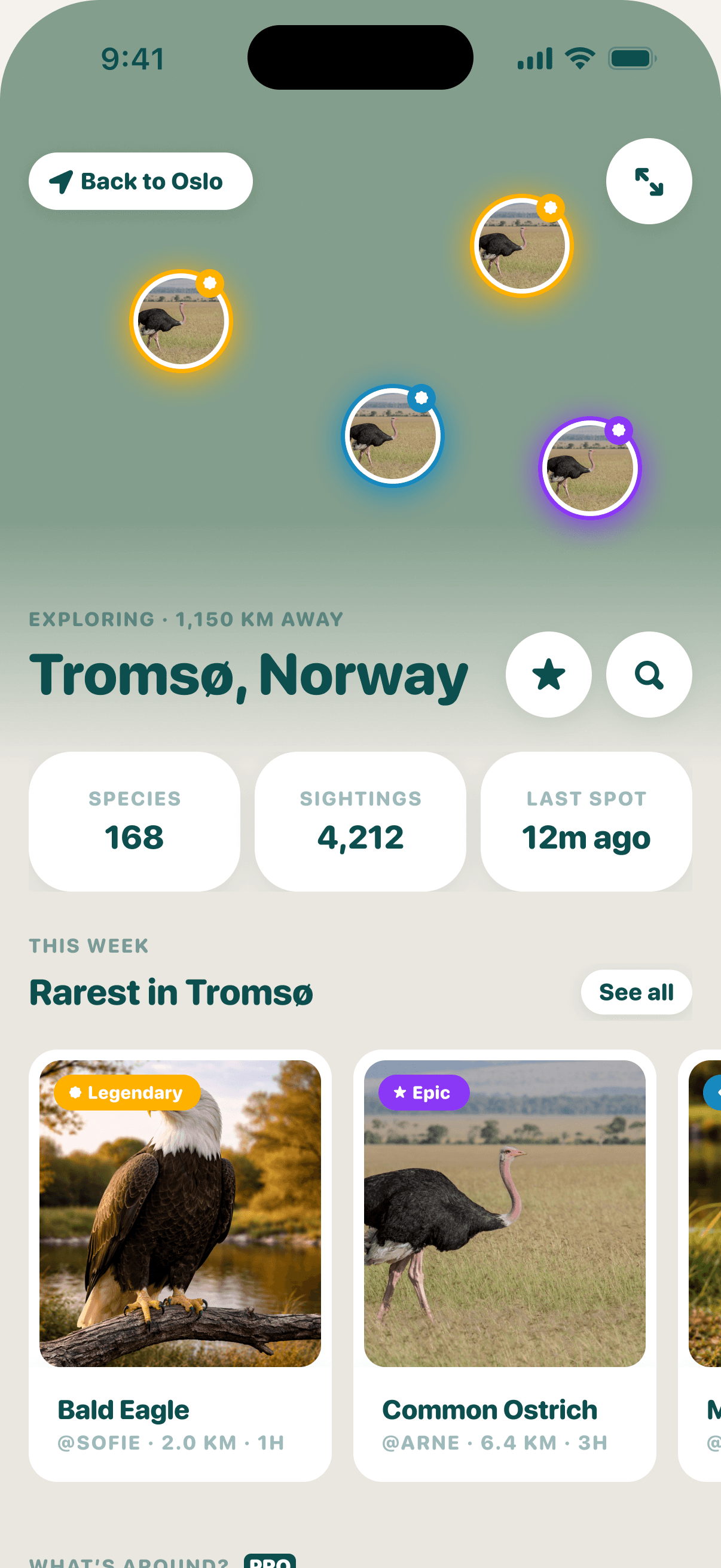
A few things took longer to figure out than I expected. The map sits at the top as a faded header, so you know it's there but the page is about the place. Tapping Expand opens it full screen on the same view, so it feels like the same map getting bigger. In the design the close button ended up in the opposite corner to Expand, which meant hunting for it every time, so I moved it to exactly where Expand was.
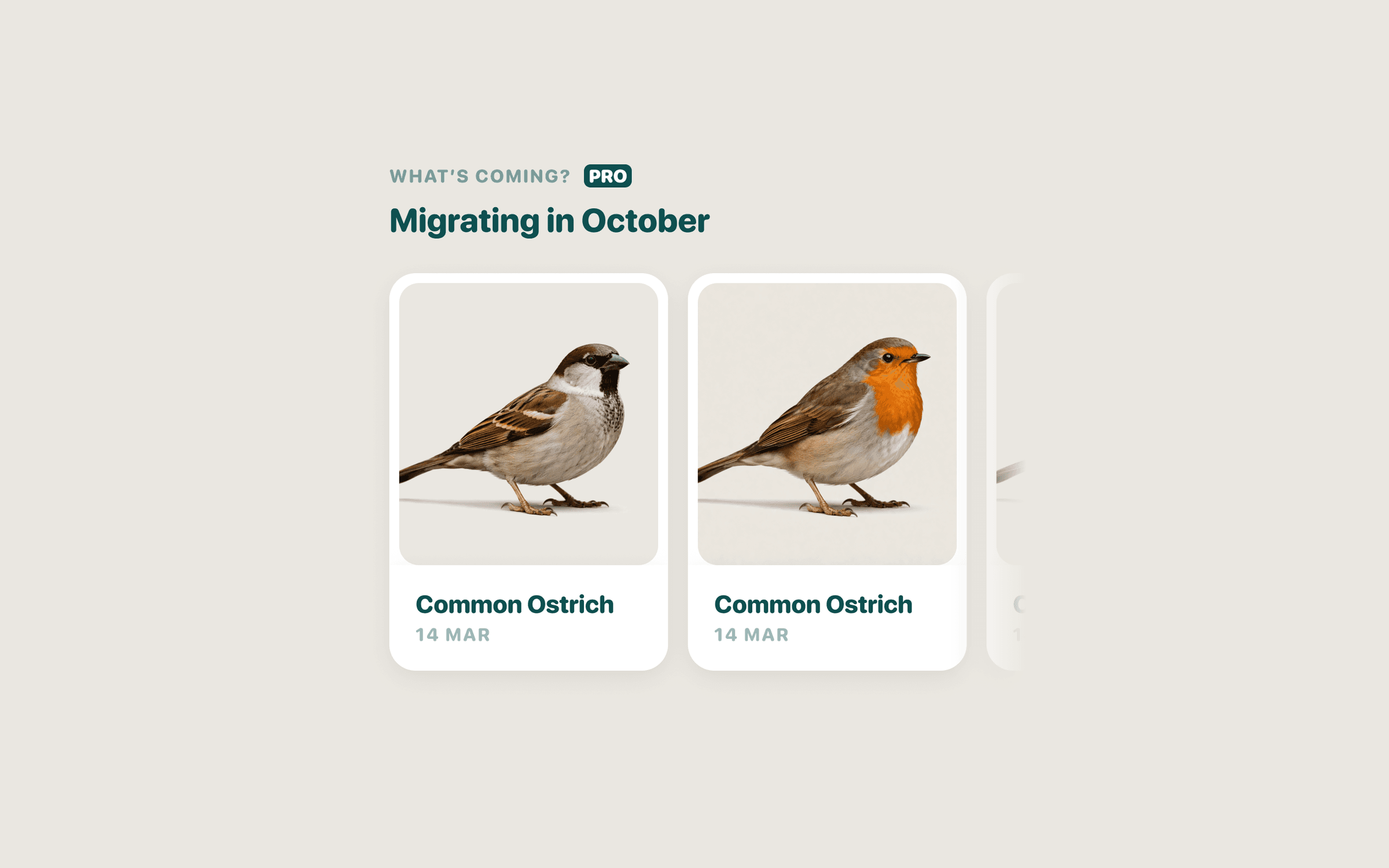
I also had to be careful about what the app could actually claim. The design had a rail called "Migrating in October", which looked lovely, but Birdie doesn't know anything about migration. It only knows what people have spotted. So it's "Spotted in October" now. Less exciting, but true.
The hardest part was places without much going on. Everything looks great in London, where there's loads of activity. Then a tester in Portsmouth opened it and got a few old posts from Southampton. Now the area grows until there's enough recent stuff to show, and the top of the page shows the birds you can see there instead of who posted last. Neither was in the design, both were obvious as soon as someone used it outside my postcode.
I built all of this with Claude reading the Figma file through Figma's MCP, instead of me describing every screen. It went better than I thought it would, mostly because James had used the same style names in Figma as we use in the app, so screens came across properly rather than being guessed at. Sending a link to a frame was also a lot easier than writing out what was wrong with the spacing. James had also left a frame of notes in the file explaining how it should all hang together, which it read and actually followed.
It is very literal though. It'll spot a gap that's 8pt when it should be 24, but it'll also happily copy a button into the wrong corner. Asking it to build to the design but flag anything that didn't make sense was the most useful thing I did. I also ran out of calls on Figma's free plan halfway through and had to upgrade, which is worth knowing before you start.
Explore is out now in Birdie 1.3.1, and the old map is gone. If you've got the app, have a look at what's around you.